
Data Visualization
When the 2015 Syrian refugee crisis reached its peak, news agencies struggled to show the sheer scale of human movement across borders. They used complex maps to track these shifts, turning raw numbers into visual stories that the public could finally grasp. This is the power of data visualization, a core tool for understanding the complex demographic shifts we explored in Station 10. By transforming abstract spreadsheets into spatial patterns, we can see how environmental pressures force people to relocate across vast geographic distances.
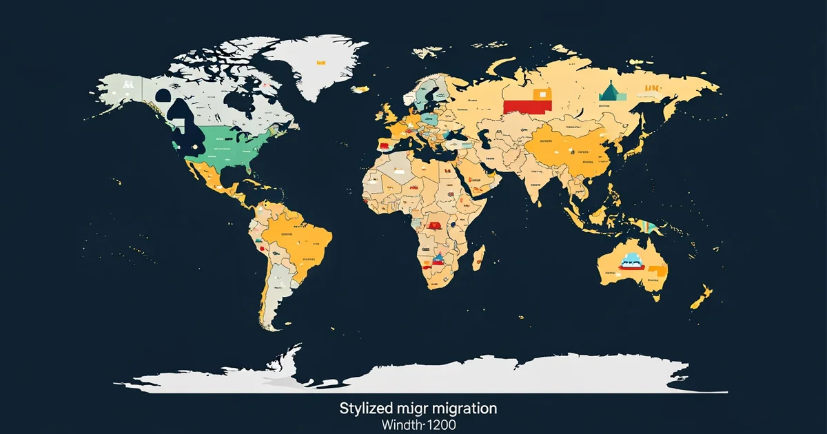
Interpreting Visual Flow Diagrams
To read a migration map, you must first identify the primary nodes and the directional arrows that connect them. Most diagrams use line thickness to represent the volume of people moving from one specific region to another. A thin line might suggest a small, steady stream of workers moving for seasonal jobs, while a thick, bold band often indicates a mass exodus caused by conflict or disaster. Think of these maps like a plumbing system in a large house, where the pipes represent the pathways and the water represents the human population moving through them. If a pipe suddenly widens, it shows a surge in pressure that requires immediate attention from local authorities and global aid groups.
Key term: Flow map — a specialized geographic diagram that uses lines of varying thickness to represent the volume and direction of movement between different locations.
When you examine these maps, you must also look for the starting and ending points of every single line. The origin point shows where people are leaving, often due to social or economic instability, while the destination shows where they hope to find better opportunities. Many modern maps use color gradients to show the intensity of this movement over time. A bright red line might indicate a rapid, recent increase in migration, whereas a faint blue line could represent a historical trend that has remained stable for several decades. Understanding these color codes is essential for recognizing which regions are currently experiencing the most significant demographic pressure.
Analyzing Spatial Patterns and Trends
Beyond simple movement, these visualizations reveal deeper structural patterns that affect entire nations and continents over long periods. By layering multiple data sets, researchers can compare migration paths against climate change maps or economic growth charts. This layering helps us see if people are moving toward areas with higher rainfall or better job security. The following table illustrates how different types of migration data are categorized for visual analysis:
| Data Category | Visual Marker | Purpose of Analysis |
|---|---|---|
| Volume | Line thickness | Assessing scale of impact |
| Direction | Arrow heads | Identifying source and target |
| Intensity | Color shading | Measuring speed of change |
Using this table, you can quickly categorize the data you encounter in any standard geographic report. When you see a map, ask yourself which variables the designer chose to emphasize and which ones they might have hidden. Data visualization is not just about showing facts, as it is also about shaping how we perceive the urgency of global events. If a map uses a bright, alarming color for a specific border crossing, it is meant to draw your eye there first. Always look past the visual flash to see the underlying numbers that tell the real story of human movement.
Finally, remember that every map is a simplified version of a much more complex reality occurring on the ground. When you look at a line on a screen, you are actually looking at thousands of individual choices made by people seeking safety or prosperity. This is the human element that data visualization often obscures, even though it remains the most important part of the entire process. By learning to read these charts with a critical eye, you become better at understanding the forces that shape our interconnected world. We must balance the cold logic of the chart with the warm reality of human experience to truly understand the global trends we see today.
Visualizing migration data allows us to convert abstract population statistics into clear spatial patterns that reveal the underlying drivers of human movement.
But these visual models often fail to account for the personal motivations of individuals who choose to stay despite extreme environmental pressures.