
Trends Over Time
Imagine you are watching a seedling grow in your backyard garden over many months. You do not just see the plant at one moment in time, but you observe how it changes from a small sprout into a tall, leafy flower. Tracking data across time works exactly like this garden observation. By placing numbers on a grid, we create a visual story that reveals how things grow, shrink, or shift over long periods. These visual tools help us understand patterns that would remain hidden if we only looked at raw, static numbers on a spreadsheet.
Visualizing Change Through Time
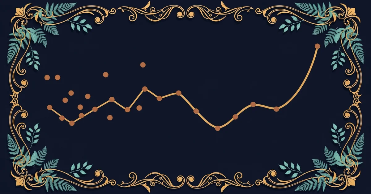
When we want to see how values change, we use a line graph to connect individual data points. Each point represents a measurement taken at a specific moment, such as the temperature at noon or the price of fruit each week. By drawing a line between these points, we create a continuous path that shows the direction and speed of change. This path acts like a map for history, allowing us to see if a value is rising, falling, or staying flat. Without the connecting line, the data points would look like random dots floating in empty space without any meaningful context.
Think of a line graph like a bank account statement showing your monthly savings over a full year. If you only look at your balance on one single day, you might feel happy or sad based on that specific number. However, the graph shows the entire journey, revealing if your savings are trending upward despite small dips along the way. This perspective allows you to see the bigger picture rather than reacting to a single moment. Much like your bank balance, data trends help you identify if your current efforts are moving you toward your long-term goals.
Interpreting Trends and Patterns
Once you have plotted your data, you can start to identify the specific trend that describes the overall movement. A trend might show a steady climb, a sharp decline, or a period of stability that lasts for many months. By looking at the slope of the line, you can determine if the change is happening quickly or slowly over time. This visual information allows you to make an educated guess about what might happen next based on historical behavior. Predicting the future becomes much easier when you can clearly see the established path from the past.
Understanding these movements requires looking at the data through a few key lenses to ensure your interpretation remains accurate and grounded in evidence:
- The slope of the line indicates the speed of change by showing how steeply the value rises or falls over a set interval.
- The volatility of the line shows how much the data fluctuates, helping you decide if the movement is a consistent path or a series of random shifts.
- The starting and ending points provide a simple comparison of total change, revealing the net result of all the activity that occurred during the period.
| Time Period | Value Measured | Trend Direction | Speed of Change |
|---|---|---|---|
| Month One | Ten Units | Upward | Moderate |
| Month Two | Fifteen Units | Upward | Fast |
| Month Three | Twelve Units | Downward | Slow |
| Month Four | Eighteen Units | Upward | Moderate |
Key term: Trend — the general direction in which a set of data points moves over a specific duration of time.
By examining the table above, you can see how the values fluctuate while still maintaining a general upward movement over the four months. This exercise teaches us that data rarely moves in a perfectly straight line, yet the overall pattern remains clear. You can use this method to analyze everything from your own study habits to the changing weather patterns in your local area. Mastering this skill allows you to turn complex numerical information into clear, actionable stories about the world around you.
Visualizing data through line graphs allows us to transform isolated numbers into meaningful stories that highlight the direction of change over time.
The next Station introduces part-to-whole relationships, which determines how we compare individual components to the total sum of a dataset.