
The Power of Contrast
Imagine you are walking down a dark street when a single, bright neon sign suddenly flickers to life. Your eyes immediately lock onto that glowing light because it stands out against the deep shadows surrounding it. This reaction is not just a habit, but a fundamental way your brain processes information in a complex, crowded world. By using contrast, creators manipulate how we perceive visual depth and importance, forcing us to notice what matters most. Without this simple but powerful tool, every element in a photograph or design would blend together into a flat, uninteresting mess.
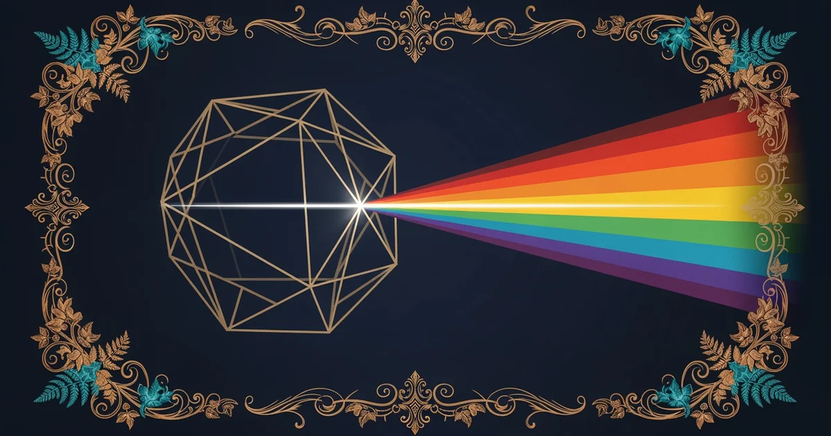
The Mechanics of Visual Difference
When we talk about visual weight, we are really discussing how much attention a specific area demands from a viewer. Contrast acts as the primary dial for this weight, turning up the volume on some parts while muting others. Think of it like a loud, clear voice speaking over a quiet, steady background hum in a crowded room. The voice cuts through the noise because it differs in pitch, volume, and rhythm from the surrounding atmosphere. In art, you create this same effect by placing dark shapes against light backgrounds or soft textures next to jagged, hard edges.
Key term: Contrast — the arrangement of opposite elements, such as light versus dark or smooth versus rough, used to create visual interest.
Because our eyes are naturally drawn to areas of high intensity, we can use these differences to guide a person through an image. If you want the viewer to look at a person’s face in a portrait, you might place them in a brightly lit spot while keeping the background dark and blurry. This technique mimics the way a spotlight works on a stage, isolating the subject from the rest of the setting. By controlling these variations, you ensure that the message of your work stays clear and impactful for the audience.
Applying Contrast in Everyday Design
To see how this works in practice, we can look at how different types of contrast change the way we interact with visual media. While light and dark are the most common forms, other types of contrast play equally important roles in how we interpret meaning. Each type serves a specific purpose in building a balanced, engaging final composition for the viewer to explore.
| Type of Contrast | Visual Effect | Common Usage |
|---|---|---|
| Tone | Light vs Dark | Creating depth and focus |
| Texture | Smooth vs Rough | Adding physical sensation |
| Size | Large vs Small | Establishing scale and power |
We can also use color to create strong visual tension, which helps separate important objects from the rest of the scene. When you choose colors that sit across from each other on a color wheel, you create a vibrant, high-energy relationship that refuses to be ignored. This is why warning signs often use bright yellow against black, as the brain is hard-wired to prioritize these high-contrast signals for safety. Below are examples of color pairings that generate this specific type of high-energy visual impact.
# High Contrast Pairs
#FF0000 Red
#00FF00 Green
#0000FF Blue
#FFFF00 Yellow
#FF7F00 Orange
#00FFFF Cyan
By mastering these simple relationships, you gain the ability to control the focus of any image you create. Every time you make a choice about where to place a shadow or how large to make an object, you are using the power of contrast to shape the viewer's experience. This process turns a simple collection of shapes and colors into a meaningful story that people can easily understand. As you continue to practice these skills, you will find that even the smallest adjustments can make a massive difference in how your work is perceived by others.
Visual contrast functions as a tool for directing attention by highlighting the most important parts of a composition against a less intense background.
The next Station introduces Semiotic Analysis, which determines how these visual signals carry deeper cultural and symbolic meaning.