
Layout Principles
A messy portfolio page often confuses the viewer because it lacks a clear path for the eye to follow. You must organize your images with intention to ensure your best work stands out from the noise of the page. Think of your portfolio layout like a well-organized store display where every item sits in a specific spot to attract a customer. Without this structure, the viewer feels lost and quickly moves on to the next portfolio in their long stack.
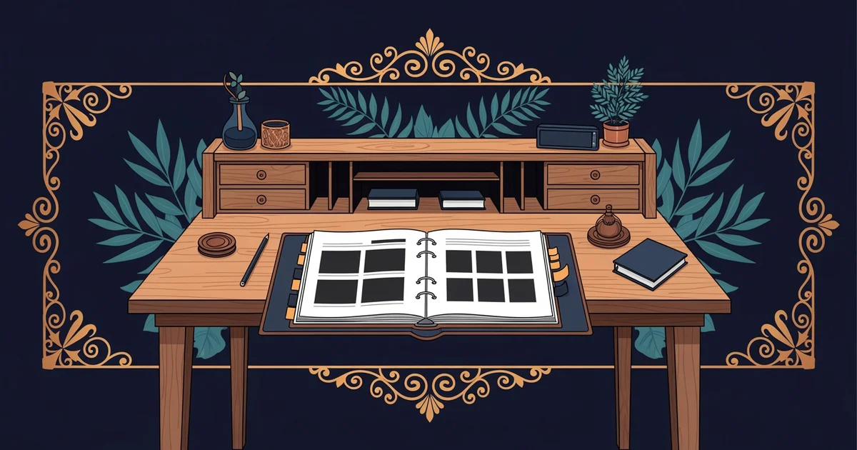
The Power of Grid Systems
When you use a grid system, you create an invisible structure that guides the viewer through your creative work. This framework uses vertical and horizontal lines to align images and text across every single page of your project. By placing items on these lines, you ensure that elements look intentional rather than randomly scattered across the white space. A strong grid provides a sense of order that makes your professional photography look clean and highly polished. It acts as the skeleton for your design, holding everything in place while you focus on the visual content itself.
Key term: Grid system — a set of intersecting lines that provide a framework for organizing visual elements on a page.
Designers often rely on these grids to maintain balance, as they prevent any one image from overpowering the rest of the collection. When you align your work to a grid, the viewer perceives a professional level of care that builds immediate trust in your skills. This consistency is essential because it keeps the focus on your art instead of the messy arrangement of your page. You can choose from several common grid formats to suit your specific project needs:
- Column grids divide the page into vertical sections that help you manage long blocks of text and images.
- Modular grids break the space into small boxes that allow for flexible arrangements of various image sizes.
- Baseline grids control the vertical spacing of text to ensure that lines align perfectly across your entire document.
Applying Layout Principles
Once you establish your grid, you must apply specific layout principles to keep the viewer interested in your story. You should use white space to give your images room to breathe so they do not feel cramped or crowded. This empty space acts as a visual break that prevents the eye from becoming tired while scanning your work. Think of it like a quiet pause in a song that makes the next loud note feel much more impactful to the listener. If you fill every corner of the page, the viewer loses the ability to distinguish between your different pieces.
| Layout Principle | Purpose | Visual Effect |
|---|---|---|
| Alignment | Unity | Clean edges |
| Proximity | Grouping | Related items |
| Contrast | Focus | Visual impact |
Another important principle is hierarchy, which dictates the order in which a person notices the different items on your page. You can create hierarchy by making your best image larger than the others or by placing it in a prominent position. This technique tells the viewer exactly where to look first to understand the main theme of your portfolio. When you control the flow of information, you guide the audience through the narrative you want to share with them. Always remember that your layout should serve the work, not distract from the beauty of your photography. A successful page design balances these elements to create a seamless experience for every person who views your creative portfolio.
Effective layout design uses invisible grids and intentional spacing to guide the viewer through your work with clarity and professional purpose.
But what does it look like in practice when we select fonts to support these visual structures?
Want this with sources you can check?
Premium Learning Paths for Visual Arts & Photography are researched against open-access libraries — PubMed, arXiv, government databases, and more — with their distinctive claims cited to real sources and independently checked.
See what Premium includes