
Basic Visual Vocabulary
Imagine you are watching a movie where the screen suddenly turns into a series of frozen, silent boxes. You must piece together the story by looking at the frozen images and reading small bubbles of text. This is exactly how a graphic novel functions as a visual language. You are not just reading words on a page; you are navigating a complex map of shapes, lines, and colors. Every choice the artist makes serves a specific purpose to guide your eyes and reveal the plot. Understanding these basic building blocks is the first step toward mastering the art of visual storytelling.
The Anatomy of the Comic Page
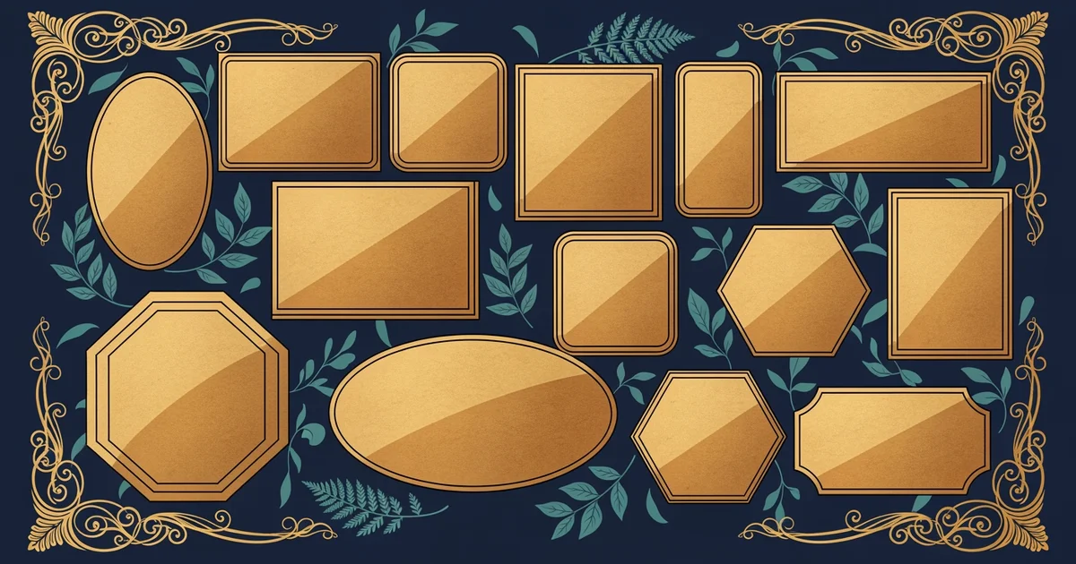
Every graphic novel begins with the basic structure of the page layout. The panel acts as the primary container for a single moment in time. Think of the panel like a window frame in your house. Just as a window limits your view to a specific slice of the outdoors, a panel limits the reader to a specific slice of the action. Artists use these frames to control the pacing of the story. A large panel often signals a moment of high importance or a slow, reflective beat. Smaller panels, by contrast, suggest rapid movement or a quick exchange of dialogue between two characters.
Key term: Panel — the distinct, bordered frame that contains a single image or action within a graphic novel sequence.
Beyond the frame itself, the space between panels plays a critical role in how you process the narrative. This empty space is known as the gutter. When your eyes move across the gutter, your brain performs a secret task. It fills in the missing action that happened between the two images. You are essentially acting as a film editor by connecting the dots in your mind. If the gutter is wide, it might signal a longer passage of time or a change in location. A narrow gutter, however, keeps the action moving quickly and keeps the reader highly engaged.
Essential Visual Elements for Narrative Flow
Once you understand how panels and gutters function, you can look at the text elements that live inside them. The speech balloon is the most common tool for showing who is talking. These bubbles have a tail that points directly toward the speaker. If the tail is a jagged line, it often indicates a loud shout or a robotic voice. If the tail is a series of small, floating circles, it suggests that the character is thinking instead of speaking aloud. You must pay attention to these shapes to understand the tone of the conversation.
To help you identify these elements, consider the following common components found on most comic pages:
- The caption box provides narration or background information that exists outside the spoken dialogue of characters.
- Sound effects use stylized, bold lettering to represent noises like crashes or whispers within the story world.
- The visual focal point directs your gaze toward the most important element of the scene before you read text.
These elements work together to ensure that the reader never feels lost on the page. Just as a store layout guides a shopper from the entrance to the checkout counter, the page design guides your eyes from the top left to the bottom right. If the artist places a character facing the left, your eyes are naturally pushed back toward the previous panel. This clever use of direction ensures that you follow the sequence of events without needing arrows or instructions. Every line and every bubble exists to serve the flow of the narrative.
Visual storytelling relies on the interplay between static frames and the reader's ability to bridge the gaps between them.
Now that you understand the basic page structure, we will explore how panel transitions influence the perception of time.