
Color Theory for Children
Imagine a storybook page where a tiny, brave mouse faces a dark, scary forest alone. If the forest is painted in bright, sunny yellows, the reader feels confused because the colors do not match the mood of the scene. Artists use specific color choices to guide how children feel about a story before they even read the first word. By picking the right shades, you help your reader understand the emotional subtext of your tale. This process is like choosing the right music for a movie scene to make sure the audience knows exactly when to feel happy, sad, or afraid.
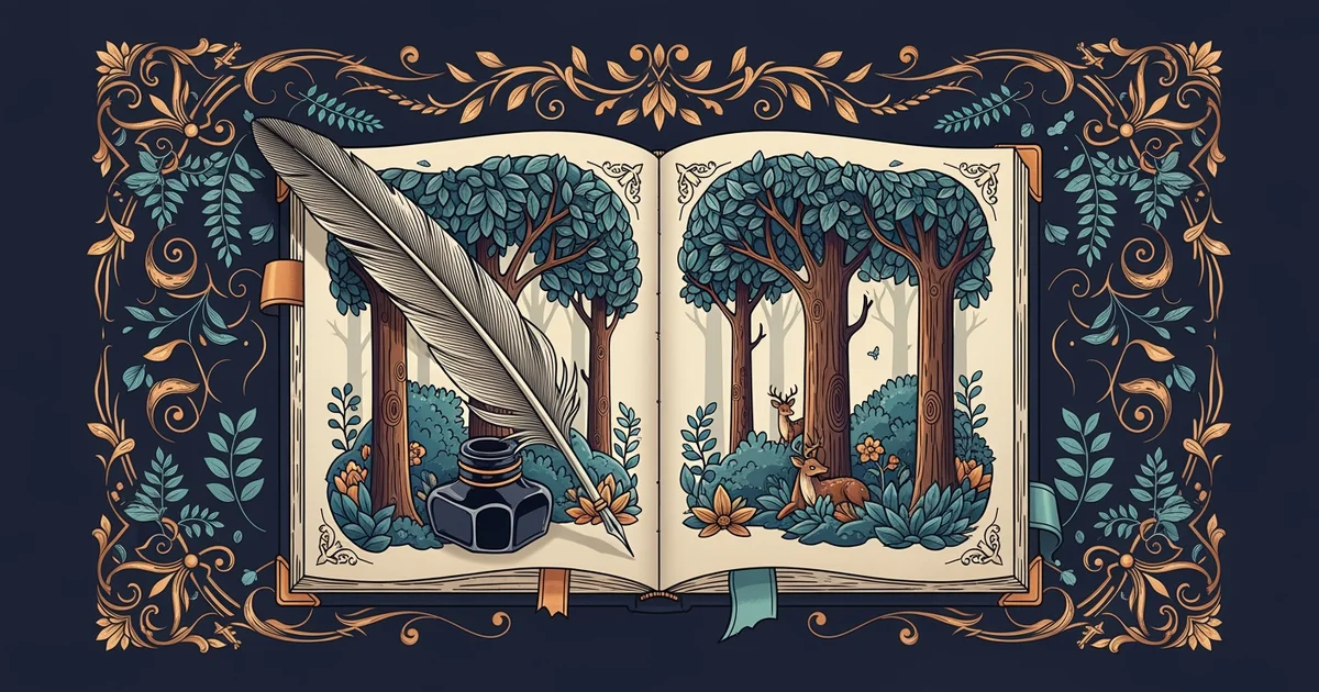
The Emotional Power of Color Palettes
When you select a group of colors for your illustrations, you are creating a color palette that acts as a silent narrator for your story. Warm colors like reds, oranges, and yellows often make children feel energetic, excited, or cozy. In contrast, cool colors like blues, purples, and greens tend to create feelings of calm, mystery, or even sadness. If you want a character to seem friendly, you might dress them in soft, warm tones. If you want a place to feel dangerous, you might use sharp, dark, or clashing colors to build tension.
Key term: Color palette — the specific range of colors an artist selects to create a consistent mood or visual style across a project.
Think of your color choices like the ingredients in a recipe for a delicious meal. If you add too much salt, the meal becomes unpleasant to eat, even if the base ingredients are quite good. Similarly, if you use too many bright, clashing colors in a sad scene, the emotion you want to show will get lost. You must balance your colors so they work together to support the story. A good artist learns to limit their choices so the main message stays clear for the young reader.
Creating Harmony Through Color Relationships
To make your pages look professional, you should study how different colors interact with each other on the page. Color harmony is the way you arrange colors so they look pleasing rather than messy or confusing to the eye. You can achieve this by using colors that sit next to each other on a color wheel, which creates a gentle, natural feeling. You can also pick colors that sit directly across from each other to create a bold, high-energy contrast that grabs the reader's attention immediately.
| Color Type | Usual Feeling | Best Use Case |
|---|---|---|
| Warm Tones | Happy/Cozy | Friendly characters |
| Cool Tones | Calm/Sad | Quiet forest scenes |
| Contrasts | Exciting/Bold | Action sequences |
When you build a scene, you must consider the balance between these different types of color relationships. If every single item on the page is a bright, contrasting color, the reader will not know where to look first. You should pick one or two main colors to dominate the page while using smaller amounts of other colors to provide detail. This strategy ensures that the reader stays focused on the most important part of your story, such as the main character or a key object.
By carefully selecting your colors, you transform a flat drawing into a world that feels alive and meaningful. Remember that colors do not just decorate the page, they tell the reader how to feel about the events unfolding in the story. Practice mixing your colors to see how they change the mood of your illustrations. As you gain more experience, you will find it easier to pick the perfect colors to match the specific emotions of every scene you design.
Choosing a deliberate set of colors allows an illustrator to communicate complex feelings without needing to use a single written word.
But what does it look like in practice when we place our words on top of these colorful illustrations?