
Data Visualization for Shoppers
When a local grocery store chain in Seattle implemented digital QR codes on their produce crates, shoppers suddenly saw the exact farm location for every apple. This shift represents the core of data visualization, where complex supply chain records transform into simple, readable visual maps for the average consumer. Most people struggle to understand the journey of their food because supply chains remain hidden behind opaque labels and marketing language. By using digital tools, shoppers can finally see the path their food traveled from the soil to the shelf. This transparency creates a new level of trust between the person who grows the food and the person who eats it.
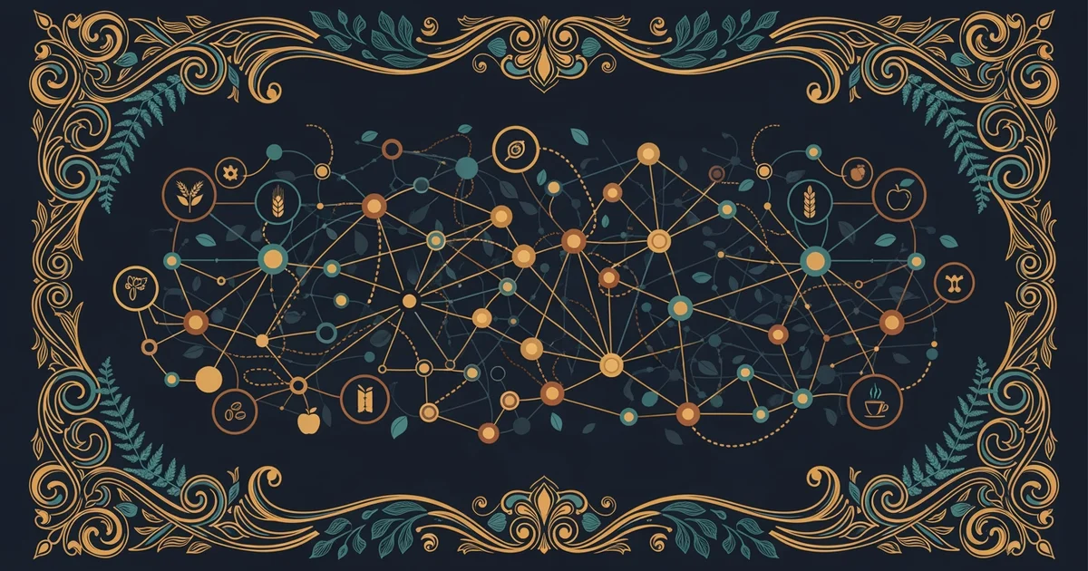
Designing Effective Tracking Systems
To build a useful tracking system, you must first identify the most important data points that matter to the final consumer. Shoppers often care about travel distance, harvest dates, and the specific methods used during the growing season. You can represent this information using a simple scorecard that assigns a grade to each item based on these factors. Think of this like a financial dashboard for your kitchen pantry, where you track the cost of your food in carbon and time rather than just currency. When you visualize this data, you turn abstract logistics into a clear story about your meal.
Key term: Data visualization — the process of turning raw supply chain numbers into graphic charts or maps that are easy to read and understand quickly.
Tracking an ingredient requires a clear plan that accounts for every stop in the journey from the field to your plate. You should start by documenting the origin, then record the transit time, and finally note the storage conditions during shipping. These steps allow you to create a visual timeline that helps you spot delays or inefficiencies in the supply chain. If you notice an item spends too much time in a warehouse, you might choose a different supplier to ensure higher quality. This level of control empowers you to make better choices about what you bring into your home.
Tools for Ingredient Transparency
When you begin to map your food sources, you can organize your findings into a clear table that highlights the most critical details for every ingredient you buy. This helps you compare different products side by side to see which ones align with your personal values for freshness and sustainability.
| Ingredient | Origin | Transit Time | Storage Temp |
|---|---|---|---|
| Spinach | Valley | 12 hours | 4 Celsius |
| Tomatoes | Plains | 48 hours | 10 Celsius |
| Carrots | Local | 2 hours | 15 Celsius |
Using these tools, you can track your ingredients by following these four steps to ensure accuracy and clarity in your final report:
- Assign a unique identification code to every single food item you purchase for your home kitchen.
- Record the exact date and time the product left the farm to establish a clear starting point.
- Log the arrival time at the local store to calculate the total duration of the entire journey.
- Review the visual map to see if the travel time matches your standards for peak food quality.
By following this process, you transform from a passive consumer into an active participant in your food supply chain. This shift allows you to demand better practices from retailers because you have the data to prove what you want. When enough shoppers start tracking their food, the entire industry must change to keep up with these new demands for transparency. You are essentially building a personal supply chain audit that forces companies to become more honest about their logistics and operations.
Visualizing supply chain data empowers shoppers to make informed decisions by turning complex logistical facts into clear, actionable information.
But this model breaks down when global supply chains become too fragmented for individual tracking tools to monitor effectively.