
Keyboard Navigation Logic
Imagine you are trying to navigate a dark room by feeling along the walls instead of using your eyes. You rely on a predictable path to reach the light switch without stumbling over furniture. Digital interfaces function exactly like this dark room when users cannot rely on a visual mouse pointer. Keyboard navigation logic serves as that steady hand against the wall, ensuring every user finds their target through a logical, sequential path. Without this clear structure, digital spaces become impossible to navigate for people who use assistive hardware. Designers must build these paths with intention to ensure that every interactive element remains reachable and functional.
The Mechanics of Sequential Focus
When a user presses the tab key, the browser moves focus from one interactive element to the next in a specific order. This process relies on the document object model to determine where the focus goes after each keystroke. Think of this like a train moving along a fixed track between stations in a city. If the tracks are laid in a random order, the passenger ends up in the wrong neighborhood, frustrated and lost. Developers must arrange the underlying code so the tab order follows the visual layout of the page. This keeps the experience predictable and mirrors how a sighted person scans a page from top to bottom.
Key term: Document object model — the tree-like structure that represents the webpage, allowing scripts to control how elements are organized and accessed.
If the tab order jumps around the screen unexpectedly, the user loses their sense of location within the interface. You should test this by unplugging your mouse and navigating only with your keyboard for ten minutes. This exercise reveals hidden obstacles that visual users never notice, such as skipped buttons or missing focus indicators. A clear focus indicator, usually a visible border around the active item, acts as the user's flashlight in that dark room. Without this visual cue, the user has no way of knowing which element is currently ready for interaction.
Designing for Predictable Interaction
Designing effective navigation requires a strict adherence to logical flow rather than artistic flair. Every interactive component must be reachable via the keyboard, including dropdown menus, modal windows, and complex sliders. If a component requires a mouse hover to reveal hidden information, the keyboard user will likely miss that content entirely. You can solve this by ensuring that all hidden content appears when the element receives focus, not just when a mouse pointer hovers over it. This creates a robust environment where the input method does not limit the available information.
To manage this complexity, many designers use a standard navigation pattern that prioritizes accessibility from the very beginning of the project:
- The skip link allows users to jump directly to the main content area, avoiding the need to tab through every single menu item on every page load.
- Logical tab order ensures that the focus moves from the header to the navigation, then to the main content, and finally to the footer.
- Focus management keeps the user within a specific component, such as a popup window, until they explicitly choose to close it.
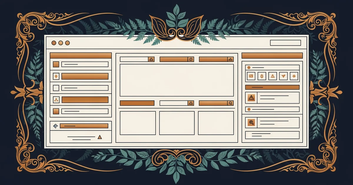
This diagram shows how a well-structured page allows a user to bypass unnecessary elements while maintaining a clear, linear path through the core content. By implementing a skip link, you provide a shortcut that saves significant time for frequent keyboard users. This simple design choice drastically improves the utility of the site for everyone, not just those with specific accessibility needs. When you prioritize the path of least resistance, you create a more efficient and welcoming digital space for all visitors.
Predictable keyboard navigation transforms a chaotic digital experience into a structured path that allows every user to reach their destination with confidence.
The next Station introduces alternative text strategies, which determine how screen readers communicate visual information to users.